Overview of all widgets
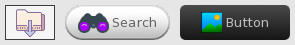
BitmapButton
The BitmapButton widget provides a button that has a small icon next to the text (or only an icon and no text).
Similar widgets:
- If you don’t want an icon and just want a button with a background texture then you should still use the Button widget instead
Documentation: BitmapButton, ButtonRenderer (BitmapButtonRenderer does not exist)
Example usage
button->setText("Click me");
button->setImage("Icon.png");

button->onPress([](const tgui::String& text){
    std::cerr << "Button with caption " << text << " was pressed\n";
});
Notes
Unlike the onClick signal, the onPress signal can also be triggered by pressing the space or return key while the button is focused.
When the Texture property is set in the renderer, the BackgroundColor and RoundedBorderRadius renderer properties will be ignored.
Button
The Button widget provides the basic funcionality for a button.
Similar widgets:
- If you don’t need Down or Hover states then you can use a Picture widget instead
- If you want the button to remain in Down state until clicking it again, then check out the ToggleButton widget
- If you want a small icon next to the button text then check out the BitmapButton widget
Documentation: Button, ButtonRenderer
Example usage
button->setText("Click me");

button->onPress([](const tgui::String& text){
    std::cerr << "Button with caption " << text << " was pressed\n";
});
Notes
Unlike the onClick signal, the onPress signal can also be triggered by pressing the space or return key while the button is focused.
When the Texture property is set in the renderer, the BackgroundColor and RoundedBorderRadius renderer properties will be ignored.
Canvas
The Canvas widget provides a way to render custom contents.
There isn’t actually a widget called Canvas, but every rendering backend has a backend-specific canvas widget to render on. For more information and examples on how to use each canvas, check the Canvas tutorial.
Documentation:
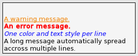
ChatBox
The ChatBox widget provides a multi-line label where each line can be given its own text style and color.
Similar widgets:
- If different text styles within a line are needed then check out the RichTextLabel widget instead
Documentation: ChatBox, ChatBoxRenderer
Example usage
chatBox->setLinesStartFromTop(false); // vertically align text to bottom
chatBox->setNewLinesBelowOthers(true); // lines are added at the bottom
chatBox->setLineLimit(100); // only keep last 100 lines at any time
chatBox->setTextColor(tgui::Color::Red); // sets default color
chatBox->setTextStyle(tgui::TextStyle::Bold); // sets default text style

chatBox->addLine("Hello"); // red + bold
chatBox->addLine("World", tgui::Color::Green); // green + bold
chatBox->addLine("World", tgui::Color::Blue, tgui::TextStyle::Italic); // blue + italic (not bold)
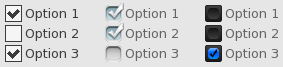
CheckBox
The CheckBox widget provides a box that is either checked or unchecked with some text displayed on the right side of the box.
Similar widgets:
- If only one option should be selectable at the same time then you can use RadioButton instead
- If you don’t need text next to the check box then you can also check out the ToggleButton widget
Documentation: CheckBox, CheckBoxRenderer
Example usage
checkBox->setText("Option 1");
checkBox->setChecked(true);
checkBox->setTextClickable(true); // Also check/uncheck when text is clicked

checkBox->onChange([](bool checked){
    if (checked)
        std::cerr << "CheckBox is now checked.\n";
    else
        std::cerr << "CheckBox is now unchecked.\n";
});
Notes
When the TextureUnchecked and TextureChecked properties are set in the renderer, the BackgroundColor renderer property will be ignored.
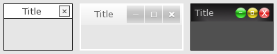
ChildWindow
The ChildWindow widget provides a way to have child windows, which are esentially panels with a title bar.
Documentation: ChildWindow, ChildWindowRenderer
Example usage
childWindow->setMinimumSize({100, 50});
childWindow->setTitle("Settings");
childWindow->setTitleButtons(tgui::ChildWindow::TitleButton::Close);
childWindow->setResizable(true);
childWindow->setKeepInParent(true); // Prevents any part of the window to go outside the screen

childWindow->onClosing([](bool* abort){
    *abort = true; // Prevents the window from being closed, onClose won't be triggered
});
childWindow->onClose([]{
    std::cerr << "ChildWindow has been closed\n";
    // childWindow->getParent()->remove(childWindow) will be called after this callback ends
});
Notes
If a child window has a close button and the onClosing callback doesn’t abort the close, then closing a child window will cause it to be removed from its parent. You can show the window again by simply adding the window to its parent like you did when creating it.
When the TextureTitleBar property is set in the renderer, the TitleBarColor renderer property will be ignored.
When the TextureBackground property is set in the renderer, the BackgroundColor renderer property will be ignored.
ClickableWidget
The ClickableWidget widget provides an invisible clickable rectangle. It is also used as the base class for several other widgets that inherit the simple mouse click events (e.g. Picture, Button, …).
Documentation: ClickableWidget, WidgetRenderer (ClickableWidgetRenderer does not exist)
Example usage
widget->setSize({100, 50});
widget->setPosition({"50%", "20%"});

widget->onMousePress([]{
    std::cerr << "Left mouse button went down on top of the widget\n";
});
widget->onClick([]{
    std::cerr << "Widget was clicked\n";
});
ColorPicker
The ColorPicker widget provides a child window in which a color can be selected.
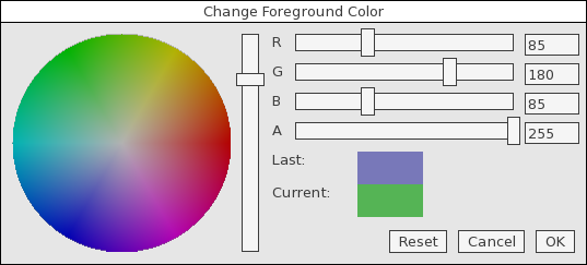
Documentation: ColorPicker, ColorPickerRenderer
Example usage
colorPicker->setTitle("Change Background Color");
colorPicker->setColor(tgui::Color::Blue); // Set initial color when opening

colorPicker->onColorChange([](const tgui::Color& color){
    std::cerr << "Color inside open window has changed\n";
});
colorPicker->onOkPress([](const tgui::Color& color){
    std::cerr << "The OK button was pressed to confirm the color selection\n";
});
colorPicker->onClose([]{
    std::cerr << "ColorPicker was closed (either by OK or Cancel)\n";
    // colorPicker->getParent()->remove(colorPicker) will be called after this callback ends
});
Notes
When the OK button is pressed, the onOkPress signal fires before onClose.
If the color was changed and the Cancel button is clicked, onColorChange will trigger with the initial color before onClose is triggered.
Closing the color picker (with either OK or Cancel button) will cause it to be removed from its parent. You can show the window again by simply adding the color picker to its parent like you did when creating it.
When the TextureTitleBar property is set in the renderer, the TitleBarColor renderer property will be ignored.
When the TextureBackground property is set in the renderer, the BackgroundColor renderer property will be ignored.
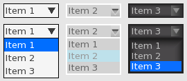
ComboBox
The ComboBox widget provides a way to select an item from a drop-down list.
Documentation: ComboBox, ComboBoxRenderer
Example usage
comboBox->addItem("First");
comboBox->addItem("Second");
comboBox->addItem("Third");
comboBox->setSelectedItemByIndex(1); // Selects "Second"

comboBox->onItemSelect([](int index){
    std::cerr << "Selected item in ComboBox changed to index " << index << "\n";
});
comboBox->onItemSelect([](const tgui::String& item){
    std::cerr << "Selected item in ComboBox changed to " << item << "\n";
});
Notes
When the TextureBackground property is set in the renderer, the BackgroundColor renderer property will be ignored.
When the TextureArrow property is set in the renderer, the ArrowBackgroundColor and ArrowColor renderer properties will be ignored.
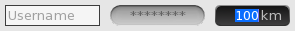
EditBox
The EditBox widget provides a single-line text field.
Similar widgets:
- If you need a multi-line text field then check out the TextArea widget instead
Documentation: EditBox, EditBoxRenderer
Example usage
editBox->setPasswordCharacter('*');
editBox->setAlignment(tgui::EditBox::Alignment::Right);
editBox->setDefaultText("Fill in password..."); // Displayed while edit box is empty

editBox->onTextChange([](const tgui::String& text){
    std::cerr << "EditBox contents was changed to " << text << "\n";
});
editBox->onReturnOrUnfocus([](const tgui::String& text){
    std::cerr << "EditBox was unfocused or return key was pressed.\n";
});
Notes
When the Texture property is set in the renderer, the BackgroundColor renderer property will be ignored.
Grid
The Grid widget provides a way to automatically position widgets beneath and beside each other. The grid can either auto-size to fit the widgets inside it, or it can be given a size in which case additional gaps can appear between widgets so that the widgets spread out to fill the given area.
Similar widgets:
- If widgets are always added to the same row until it is full then check out the HorizontalWrap widget
- If the size of the child widgets should also be determined by the grid size then maybe HorizontalLayout and VerticalLayout would be better options
Documentation: Grid, WidgetRenderer (GridRenderer does not exist)
Example usage
// Only call setWidgetCell after adding the widget with the add() function
// Make sure to add the widget to the grid with the add() function before calling setWidgetCell.
// You need to call setWidgetCell for each widget in the grid. The function has several parameters:
// - The widget for which you want to set (or change) the grid location
// - Row number in which the widget needs to be placed (starting from 0)
// - Column number in which the widget needs to be placed (starting from 0)
// - Optional alignment within the cell (in case widget is smaller than those in same row or column)
// - Optional padding to add around the widget
grid->setWidgetCell(widget1, 0, 0);
grid->setWidgetCell(widget2, 0, 1);
grid->setWidgetCell(widget3, 3, 1);

// Assuming the widgets have sizes of 200x150, 100x100 and 300x200, the above lines cause the following:
// - The top row will have a height of max(150,100) = 150
// - Rows 1 and 2 don't exist as they contain no widgets, the second row will be row number 3
// - The second row has height 200
// - The first column has a width of 200
// - The second column has a width of max(100,300) = 300
// - The cell (0,1) thus has size 300x150 in which widget2 with size 100x100 will be centered
// - The size of the grid will be 350x500

// Calling setSize stops the grid from auto-sizing and will move widgets to fill the size.
// With the above conditions, widget3 will be placed 400-350 = 50 pixels lower after this.
// If there were more rows, the extra 50 pixels would be evenly divided between the rows.
grid->setSize({400, 500});
Notes
There is an addWidget function which the same parameters as setWidgetCell which calls add and setWidgetCell together.
You should never call setPosition on any child widget that is added to Grid.
Group
The Group widget provides an invisible rectangle that holds a collection of widgets. As widgets have a position relative to their parent, using a Group is useful for moving multiple widgets at once. Different menus in a program could also consist of a Group per screen so that switching menu is as simple as hiding one group and showing another one.
Similar widgets:
- If you need a background or borders then use the Panel widget instead
Documentation: Group, GroupRenderer
Example usage
group->add(widget); // Add the child widget to the group instead of directly to the gui

// The line below will set a 5px padding on all 4 sides of the group.
// A widget with position (0,0) and size (100%,100%) inside a group of size (800,600)
// will appear on the screen at position (5,5) with a size of (790,590)
group->getRenderer()->setPadding({5});
Notes
While the group itself is invisible, it still has a size. Any child widgets positioned outside this size are clipped.
If the mouse isn’t interacting with a child widget inside the group, then the mouse events are passed to the widgets behind the group (if there would be any). If events must be absorbed by the group and should never pass to any widgets behind it then use the Panel widget instead (its background color can be set to tgui::Color::Transparent to be invisible).
If no position or size is given for the group, it will fill its entire parent area.
HorizontalLayout
The HorizontalLayout widget provides a way to automatically position and resize widgets to fill a given area. All child widgets will be placed left and right of each other, the height of each widget will equal the height of the HorizontalLayout.
Similar widgets:
- If you need to place widgets beneath each other then check out the VerticalLayout widget instead
- If you only want to automatically position widgets but give them a manual size, then check out the Grid widget instead
Documentation: HorizontalLayout, BoxLayoutRenderer (HorizontalLayoutRenderer does not exist)
Example usage
horiLayout->setSize(500, 100);

horiLayout->add(button1);    // ratio = 1
horiLayout->addSpace(0.5);   // ratio = 0.5
horiLayout->add(button2, 2); // ratio = 2
horiLayout->addSpace(0.5);   // ratio = 0.5
horiLayout->add(button3);    // ratio = 1

// sum of ratios: 5
// width of horiLayout: 500
// width of spaces (gaps between widgets): 0.5 / 5 * 500 = 50
// width of button1 and button3: 1 / 5 * 500 = 100
// width of button2: 2 / 5 * 500 = 200
Notes
The size of the HorizontalLayout (both width and height) must be provided, and child widgets will be resized to fit this size. It is not possible to have the layout grow as more widgets are added. You could however manually update the size every time you add a widget, but then the widget is of limited use.
You should never call setPosition or setSize on any child widget that is added to HorizontalLayout.
HorizontalWrap
The HorizontalWrap widget provides a way to automatically position widgets beside and beneath each other. Widgets that are added to it are placed next to each other, until the widget would no longer fit on the row in which case a it will be placed below the others at the left side of the new row.
Similar widgets:
- If you want the widgets placed in a grid but want to control the row and column of each widget then check out the Grid widget instead
Documentation: HorizontalWrap, BoxLayoutRenderer (HorizontalWrapRenderer does not exist)
Example usage
horiWrap->setSize({100, 200});
horiWrap->getRenderer()->setPadding({5}); // Keep 5px on all sides as empty space
horiWrap->getRenderer()->setSpaceBetweenWidgets(10); // Put a 10px gap beside and below widgets

horiWrap->add(widget1);
horiWrap->add(widget2);
horiWrap->add(widget3);

// Assume the 3 child widgets have size 50x50. Their positions will be as follows:
// - widget1 is at position (5,5)
// - widget2 is at position (65,5)
// - widget3 is at position (5,65)
Notes
The size of the HorizontalWrap (both width and height) must be provided. It is not possible to have the container grow as more widgets are added.
You should never call setPosition on any child widget that is added to HorizontalWrap.
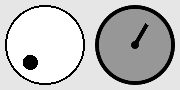
Knob
The Knob widget provides a circular dial that can be rotated to the wanted value.
Similar widgets:
- If you want to select the value on a straight line then use the Slider widget instead
Documentation: Knob, KnobRenderer
Example usage
knob->setMinimum(0);
knob->setMaximum(100);
knob->setValue(25);

knob->setStartRotation(240); // The knob should point to the bottom left if value is 0
knob->setEndRotation(300); // The knob should point to the bottom right if value is 100
knob->setClockwiseTurning(true); // Thumb can't point downwards, we go clockwise from start to end angle

// If no foreground texture would be set, a small circle is drawn inside the knob.
// The texture replaces this circle by something custom.
knob->getRenderer()->setTextureForeground("Arrow.png");
knob->getRenderer()->setImageRotation(90); // Unrotated Arrow.png image points upwards

knob->onValueChange([](float value){
    std::cerr << "Value of the knob was changed to " << value << "\n";
});
Notes
All angles need to specified in the half-open interval [0,360) where 0 is the right side and 90 is upwards.
When the TextureBackground property is set in the renderer, the BackgroundColor renderer property will be ignored.
When the TextureForeground property is set in the renderer, the ThumbColor renderer property will be ignored.
Label
The Label widget provides a way to display some non-interactive text. This can be either a simple line of text, or a box with word-wrap and scrollbars.
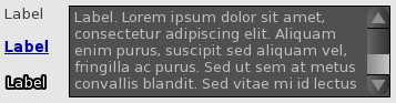
Similar widgets:
- If the text formatting (e.g. color) should be different in parts of the label then check out the RichTextLabel widget instead
Documentation: Label, LabelRenderer
Example usage
// If setSize isn't called then the label auto-sizes based on the text it contains
label->setText("Hello world.\nLorem ipsum dolor sit amet");

// An auto-sizing label can be given a maximum width where text should start at a new line
label->setMaximumTextWidth(300);

// If setSize is called then the size no longer depends on the text inside the label
// and a vertical scrollbar can appear if the text does not fit.
label->setSize({300, 400});
label->setHorizontalAlignment(tgui::Label::HorizontalAlignment::Right);

label->onClick([]{
    std::cerr << "Label was clicked\n";
});
label->onDoubleClick([]{
    std::cerr << "Label was double-clicked\n";
});
Notes
If the label should be rendered on top of another widget that should receive the events then you can use label->ignoreMouseEvents(true) to let all mouse events pass through the label.
When the TextureBackground property is set in the renderer, the BackgroundColor renderer property will be ignored.
ListBox
The ListBox widget provides a list of selectable items.
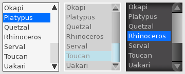
Similar widgets:
- If you need a header, multiple columns, lines between items or an icon before the text, then you should check out the ListView widget instead
Documentation: ListBox, ListBoxRenderer
Example usage
listBox->addItem("First");
listBox->addItem("Second");
listBox->addItem("Third");
listBox->setSelectedItemByIndex(1); // Selects "Second"
listBox->setTextAlignment(tgui::ListBox::TextAlignment::Center);

listBox->onItemSelect([](int index){
    std::cerr << "Selected item in ListBox changed to index " << index << "\n";
});
listBox->onItemSelect([](const tgui::String& item){
    std::cerr << "Selected item in ListBox changed to " << item << "\n";
});
Notes
When the TextureBackground property is set in the renderer, the BackgroundColor renderer property will be ignored.
ListView
The ListView widget provides a list of selectable items, potentially with multiple columns.
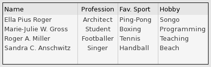
Similar widgets:
- If you only need one column and don’t need a header, lines between items or an icon before the text, then you should check out the ListBox widget instead
Documentation: ListView, ListViewRenderer
Example usage
listView->addColumn("Name", 210);
listView->addColumn("Size", 75, tgui::ListView::ColumnAlignment::Right);
listView->addColumn("Modified", 140, tgui::ListView::ColumnAlignment::Right);
listView->setResizableColumns(true);

listView->addItem({"bin", "", "22 Nov 2021  22:18"});
listView->addItem({"form.txt", "41.7 KB", "21 Nov 2019  08:28"});
listView->addItem({"Linux.bmp", "1.4 MB", "1 Aug 2020  15:12"});

listView->onItemSelect([](int index){
    std::cerr << "Selected item in ListView changed to index " << index << "\n";
});
listView->onItemSelect([](int index){
    std::cerr << "Item with index " << index << " was double clicked\n";
});
listView->onHeaderClick([lv=listView.get()](int index){
    std::cerr << "Header at index " << item << " was clicked.\n";

    // Sort the rows in the list view in ascending order based on the clicked column.
    // This only affects existing items, adding new items later requires calling sort again.
    lv->sort(index, [](const tgui::String& a, const tgui::String& b) { return a < b; });
});
Notes
When the TextureBackground property is set in the renderer, the BackgroundColor renderer property will be ignored.
When the TextureHeaderBackground property is set in the renderer, the HeaderBackgroundColor renderer property will be ignored.
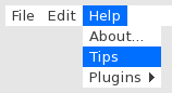
MenuBar
The MenuBar widget provides a menu bar that can open menus below or above it.
Documentation: MenuBar, MenuBarRenderer
Example usage
// You can add menus and the items in them sequentially
menuBar->addMenu("File");
menuBar->addMenuItem("Load");
menuBar->addMenuItem("Save");
menuBar->addMenu("Edit");
menuBar->addMenuItem("Undo");

// Or you can provide a hierarchy (which is needed if you want submenus)
menuBar->addMenuItem({"Edit", "Redo"});
menuBar->addMenuItem({"Format", "Text", "Bold"});

// You can add separator lines by setting the text to "-"
menuBar->addMenuItem({"Edit", "-"});

menuBar->setMenuItemEnabled({"Edit", "Redo"}, false);

menuBar->onMenuItemClick([](const std::vector<tgui::String>& menuItem){
    if (menuItem.size() == 2 && menuItem[0] == "File" && menuItem[1] == "Load")
        std::cerr << "File > Load was clicked\n";
});
menuBar->connectMenuItem({"File", "Save"}, []{
    std::cerr << "File > Save was clicked\n";
});
Notes
The connectMenuItem will internally do the same as adding an onMenuItemClick callback that compares whether the clicked menu item matches with the connected item.
When the TextureBackground property is set in the renderer, the BackgroundColor renderer property will be ignored for the menu bar.
When the TextureItemBackground property is set in the renderer, the BackgroundColor and SelectedBackgroundColor renderer property will be ignored for the menus.
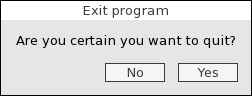
MessageBox
The MessageBox widget provides a child window that displays a message with some buttons below it.
Documentation: MessageBox, MessageBoxRenderer
Example usage
messageBox->setText("Are you sure?");
messageBox->addButton("Yes");
messageBox->addButton("No");
messageBox->setButtonAlignment(tgui::MessageBox::Alignment::Right);

messageBox->onButtonPress([msgBox=messageBox.get()](const tgui::String& button){
    assert(button == "Yes" || button == "No);
    std::cerr << "The " << button << " button was pressed\n";

    // Remove the message box from its parent to stop showing it
    msgBox->getParent()->remove(msgBox->shared_from_this());
});
Notes
You can still interact with widgets outside the message box. If you do not want this, then you should e.g. place a semi-transparent black panel behind the message box that fills the entire screen, and then remove it again when the window is closed.
When the TextureTitleBar property is set in the renderer, the TitleBarColor renderer property will be ignored.
When the TextureBackground property is set in the renderer, the BackgroundColor renderer property will be ignored.
Panel
The Panel widget provides a collection of widgets with a background behind them.
Similar widgets:
- If the panel needs to be invisible then check out the Group widget instead
Documentation: Panel, PanelRenderer
Example usage
panel->add(widget); // Add the child widget to the panel instead of directly to the gui

// Set the background of the panel. You could also use setTextureBackground for an image.
panel->getRenderer()->setBackgroundColor(tgui::Color::Blue);

// The line below will set a 5px padding on all 4 sides of the group.
// A widget with position (0,0) and size (100%,100%) inside a panel of size (800,600)
// will appear on the screen at position (5,5) with a size of (790,590)
panel->getRenderer()->setPadding({5});
PanelListBox
The PanelListBox widget provides a list of selectable items, where each item is a panel that can contain any chosen widgets.
Similar widgets:
- If each item should only contain a simple label then check out the ListBox widget instead
Documentation: PanelListBox, PanelListBoxRenderer
Example usage
// Design how you want each row to look by adding widgets to the hidden template panel
tgui::Panel::Ptr templatePanel = listBox->getPanelTemplate();
tgui::Picture::Ptr templatePic = tgui::Picture::create();
templatePic->setOrigin({0.5f, 0.5f});
templatePic->setPosition({"50%", "50%"});
templatePanel->add(templatePic, "PicName");

// Adding items will create a new visible panel that is copied from the template panel
tgui::Panel::Ptr itemPanel1 = listBox->addItem();
tgui::Picture::Ptr itemPic = itemPanel1->get<tgui::Picture>("PicName");
itemPic->getRenderer()->setTexture("image1.png");

tgui::Panel::Ptr itemPanel2 = listBox->addItem();
itemPanel2->get<tgui::Picture>("PicName")->getRenderer()->setTexture("image2.png");

listBox->setItemsHeight(50); // Give each panel a height of 50px

// Choose the background color of all item panels
listBox->getRenderer()->setItemsBackgroundColor(tgui::Color::White);
listBox->getRenderer()->setSelectedItemsBackgroundColor(tgui::Color::Blue);
listBox->setSelectedItemByIndex(0);

listBox->onItemSelect([](int index){
    std::cerr << "Selected item in PanelListBox changed to index " << index << "\n";
});
Notes
You should never call setPosition or setSize on the template panel or any of the item panels. The list box controls the position and size of each item.
Picture
The Picture widget provides a way to show a static image.
Documentation: Picture, PictureRenderer
Example usage
auto picture = tgui::Picture::create("image1.png");
picture->getRenderer()->setTexture("image2.png"); // To change image after construction

picture->onClick([]{
    std::cerr << "Picture was clicked\n";
});
picture->onDoubleClick([]{
    std::cerr << "Picture was double-clicked\n";
});
Notes
If the image should be rendered on top of another widget that should receive the events then you can use picture->ignoreMouseEvents(true) to let all mouse events pass through the picture.
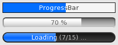
ProgressBar
The ProgressBar widget provides a loading bar to indicate progress.
Documentation: ProgressBar, ProgressBarRenderer
Example usage
progressBar->setMinimum(0);
progressBar->setMaximum(200);

progressBar->setValue(70);
progressBar->incrementValue(); // set value to 71
progressBar->setText("71%");

progressBar->onValueChange([](unsigned int value){
    std::cerr << "ProgressBar value has changed to " << value << "\n";
});
progressBar->onFull([]{
    std::cerr << "ProgressBar value has reached the maximum\n";
});
Notes
When the TextureBackground property is set in the renderer, the BackgroundColor renderer property will be ignored.
When the TextureFill property is set in the renderer, the FillColor renderer property will be ignored.
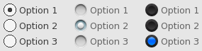
RadioButton
The RadioButton widget provides a box of which at most one of them can be checked, with some text displayed on the right side of the box.
Similar widgets:
- If multiple options should be possible or if it should be possible to uncheck a checked box then you should use CheckBox instead
Documentation: RadioButton, RadioButtonRenderer
Example usage
radioButton->setText("Option 1");
radioButton->setChecked(true); // This will uncheck all others with the same parent
radioButton->setTextClickable(true); // Also check/uncheck when text is clicked

// While the user can't uncheck a radio button, you can do it in code
radioButton->setChecked(false);

radioButton->onCheck([]{
    std::cerr << "The RadioButton is now checked.\n";
});
Notes
Whenever a radio button is checked, it will look for other radio buttons that were added to the same parent and uncheck them. If you wish to create multiple groups of radio buttons when one option can be checked per group then each group should be added to a separate container (e.g. a RadioButtonGroup, Group or Panel widget).
When the TextureUnchecked and TextureChecked properties are set in the renderer, the BackgroundColor renderer property will be ignored.
RadioButtonGroup
The RadioButtonGroup widget provides an invisible container in which you can add radio buttons to group them together.
Similar widgets:
- If the group needs to have a position and size then use the Group widget instead
- If the group needs to have a background color then use the Panel widget instead
Documentation: RadioButtonGroup, WidgetRenderer (RadioButtonGroupRenderer does not exist)
Example usage
group->add(radioButton1);
group->add(radioButton2);

// RadioButtonGroup provides a helper function to uncheck all radio buttons inside it
group->uncheckRadioButtons();
Notes
Unlike the Group widget, a RadioButtonGroup has no size. You can freely place radio buttons (or other widgets) inside it without them being clipped if they wouldn’t fit.
You still need to manully position the radio buttons inside the group, it does not provide any functionality to e.g. automatically place them below each other.
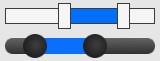
RangeSlider
The RangeSlider widget provides a horizontal or vertical slider with 2 knobs in order to select a range.
Similar widgets:
- If you only need a single knob then check out the Slider widget instead
Documentation: RangeSlider, RangeSliderRenderer
Example usage
slider->setMinimum(100);
slider->setMaximum(200);
slider->setStep(5);
slider->setSelectionStart(150); // Position for first knob
slider->setSelectionEnd(160); // Position for second knob

slider->onRangeChange([](float start, float end){
    std::cerr << "New range selected in RangeSlider is " << start << "-" << end << "\n";
});
Notes
When the TextureTrack property is set in the renderer, the TrackColor renderer property will be ignored.
When the TextureThumb property is set in the renderer, the ThumbColor renderer property will be ignored.
When the TextureSelectedTrack property is set in the renderer, the SelectedTrackColor renderer property will be ignored.
RichTextLabel
The RichTextLabel widget provides a way to display some non-interactive text with different text styles and colors.
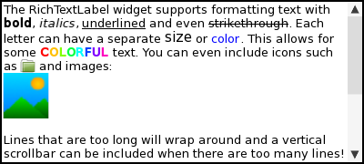
Similar widgets:
- If the entire text will be the same style and color then you can use the Label widget instead
Documentation: RichTextLabel, LabelRenderer (RichTextLabelRenderer does not exist)
Example usage
label->setSize({300, 400});
label->setHorizontalAlignment(tgui::RichTextLabel::HorizontalAlignment::Right);

label->setTextSize(13); // Set default text size
label->getRenderer()->setTextColor(tgui::Color::Yellow); // Set default text color

// Supported text formatting tags: <b>, <i>, <u>, <s>, <size>, <color>
label->setText("<b><color=#ff0000>bold</color></b>\n<i><size=15>italics</size></i>");

// The text can contain images as well. The <img> tag should not be closed.
label->setText("Text with <img=img1.png> and <img=\"img2.png\"> inside");
Notes
When the TextureBackground property is set in the renderer, the BackgroundColor renderer property will be ignored.
ScrollablePanel
The ScrollablePanel widget provides a panel that gets scrollbars when the contents inside the panel is too large to fit inside the panel.
Similar widgets:
- If you don’t need the scrollbars then you can use a regular Panel widget instead
- If you don’t want the panel but instead want full control over the scrolling then you can use the Scrollbar widget instead
Documentation: ScrollablePanel, ScrollablePanelRenderer
Example usage
panel->setSize({300, 200});
panel->setContentSize({300, 1000});

// Set when each scrollbar shows up. There are 3 policies:
// - Always: always show the scrollbar, no matter what the content size is.
// - Automatic: only show scrollbar if content size is larger than size.
// - Never: always hide the scrollbar, no matter what the content size is.
// Our content width is set equal to the panel width above, so without
// the Never policy our horizontal scrollbar would appear in the case
// where the vertical scrollbar becomes visible (because it would shrink
// the available width to below the configured content width).
panel->setVerticalScrollbarPolicy(tgui::Scrollbar::Policy::Automatic);
panel->setHorizontalScrollbarPolicy(tgui::Scrollbar::Policy::Never);

// Set how much is scrolled when the arrow of the scrollbar is clicked,
// or when the mouse wheel is scrolled.
panel->setVerticalScrollAmount(50);
Notes
When the TextureBackground property is set in the renderer, the BackgroundColor renderer property will be ignored.
Scrollbar
The Scrollbar widget provides just the scrollbar itself, without anything to scroll through.
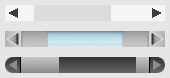
Similar widgets:
- If want a panel in which the contents moved with the scrollbar then check out the ScrollablePanel widget instead
Documentation: Scrollbar, ScrollbarRenderer
Example usage
// Value will go from 0-150, with the thumb size will be 1/4th of the bar
scrollbar->setMaximum(200);
scrollbar->setViewportSize(50);

// Set how much the value is changed each time the arrow is clicked,
// or when the mouse wheel is scrolled.
scrollbar->setScrollAmount(25);

// Specify whether you want the scrollbar to be visible when the viewport size
// is greater or equal to the specified maximum.  The thumb will fill the
// entire bar in this case and the value can only be 0.
scrollbar->setAutoHide(false);

scrollbar->setValue(60);

scrollbar->onValueChange([](float value){
    std::cerr << "Scrollbar value was changed to " << value << "\n";
});
Notes
If AutoHide is true and ViewportSize >= Maximum then the scrollbar won’t be drawn.
When the TextureArrowUp and TextureArrowDown properties are set in the renderer, the ArrowBackgroundColor and ArrowColor renderer properties will be ignored.
When the TextureTrack property is set in the renderer, the TrackColor renderer property will be ignored.
When the TextureThumb property is set in the renderer, the ThumbColor renderer property will be ignored.
SeparatorLine
The SeparatorLine widget provides a horizontal or vertical line of a certain color that can be used to visually separate widgets. It is esentially just a colored rectangle, it is NOT a real draggable separator to grow or shrink a container (TGUI currently does not support such thing).
Documentation: SeparatorLine, SeparatorLineRenderer
Example usage
line->setPosition({5, 100});
line->setSize({490, 2});
line->getRenderer()->setColor(tgui::Color::Black);
Slider
The Slider widget provides a horizontal or vertical slider to select a value from a range.
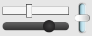
Similar widgets:
- If you need two knobs to select a range instead of a single value then check out the RangeSlider widget instead
- If you want to select the value from a dial then check out the Knob widget instead
Documentation: Slider, SliderRenderer
Example usage
slider->setMinimum(100);
slider->setMaximum(200);
slider->setStep(5);
slider->setValue(135);

slider->onValueChange([](float value){
    std::cerr << "Slider value was changed to " << value << "\n";
});
Notes
When the TextureTrack property is set in the renderer, the TrackColor renderer property will be ignored.
When the TextureThumb property is set in the renderer, the ThumbColor renderer property will be ignored.
SpinButton
The SpinButton widget provides an up and down arrow to select a value.
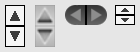
Similar widgets:
- If you want there to be an edit box attached to the arrows then check out the SpinControl widget instead
Documentation: SpinButton, SpinButtonRenderer
Example usage
spinButton->setMinimum(100);
spinButton->setMaximum(200);
spinButton->setStep(5);
spinButton->setValue(135);

spinButton->onValueChange([](float value){
    std::cerr << "SpinButton value was changed to " << value << "\n";
});
Notes
When the TextureArrowUp and TextureArrowDown properties are set in the renderer, the BackgroundColor and ArrowColor renderer properties will be ignored.
SpinControl
The SpinControl widget provides an edit box with an up and down arrow next to it.
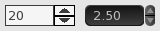
Similar widgets:
- If you just want the arrows without the edit box then check out the SpinButton widget instead
Documentation: SpinControl, WidgetRenderer (SpinControlRenderer does not exist)
Example usage
spinControl->setMinimum(10);
spinControl->setMaximum(20);
spinControl->setStep(1);
spinControl->setValue(15);
spinControl->setDecimalPlaces(1); // Display "15.0" instead of "15"

spinControl->onValueChange([](float value){
    std::cerr << "SpinControl value was changed to " << value << "\n";
});
Notes
The renderer for the edit box and spin button can be accessed with getSpinTextRenderer() and getSpinButtonRenderer().
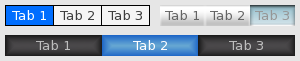
TabContainer
The TabContainer widget provides a row of tabs and a panel below or above it that changes when a different tab is selected.
Similar widgets:
- If you don’t want to have a panel attached to the tabs then check out the Tabs widget instead
Documentation: TabContainer, WidgetRenderer (TabContainerRenderer does not exist)
Example usage
tabContainer->setTabHeight(25);
tabContainer->setSize({400, 325}); // Panels will be 400x300

tgui::Panel::Ptr panel1 = tabContainer->addTab("Tab 1");
tgui::Panel::Ptr panel2 = tabContainer->addTab("Tab 2");

tabContainer->select(0); // Selects "Tab 1" and shows panel1 while panel2 is hidden

tabContainer->setTabAlignment(tgui::TabContainer::TabAlign::Top); // Tabs above panels

// By default the tabs fill the entire width. You can choose to have a fixed size per tab instead.
tabContainer->setTabFixedSize(200);

tabContainer->onSelectionChanged([](int index){
    std::cerr << "The tab and panel with index " << index << " is now selected\n";
});
Notes
The renderer for the tabs can be accessed with getTabsRenderer().
Tabs
The Tabs widget provides a row of tabs where one can be selected.
Similar widgets:
- If you want there to be a panel directly below or above the tabs which is changed when a tab is selected then check out the TabContainer widget instead
Documentation: Tabs, TabsRenderer
Example usage
tabs->add("Tab 1");
tabs->add("Tab 2");
tabs->select(0); // Selects "Tab 1"

// If no width is set then the size of each tab depends on the text inside
tabs->setTabHeight(30);
tabs->setMinimumTabWidth(120);

// If a width is set then all tabs have the same width to fill the given size
tabs->setSize({250, 30});

tabs->onTabSelect([](const tgui::String& tab){
    std::cerr << "The tab " << tab << " is now selected\n";
});
Notes
The MinimumTabWidth and MaximumTabWidth properties have no effect when not auto-sizing (i.e. when setSize was called).
Calling setHeight turns auto-sizing off because it calls setSize internally. If this is unwanted then either use setTabHeight instead of setHeight or use setAutoSize afterwards to re-enable auto-sizing.
When the TextureTab property is set in the renderer, the BackgroundColor renderer property will be ignored.
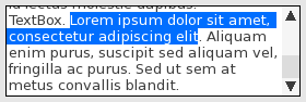
TextArea
The TextArea widget provides a multi-line text field.
Similar widgets:
- If you need a single-line text field then check out the EditBox widget instead
Documentation: TextArea, TextAreaRenderer
Example usage
textArea->setText("Hello world.\nLorem ipsum dolor sit amet");

textArea->onTextChange([](const tgui::String& text){
    std::cerr << "TextArea contents was changed to " << text << "\n";
});
Notes
When the TextureBackground property is set in the renderer, the BackgroundColor renderer property will be ignored.
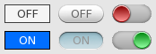
ToggleButton
The ToggleButton widget provides a button for which the down state can be toggled (i.e. it remains in down state after clicking the button until it is clicked again).
Similar widgets:
- If you are looking for a normal button then check out the Button widget instead
Documentation: ToggleButton, ButtonRenderer (ToggleButtonRenderer does not exist)
Example usage
button->setText("ON");
button->setDown(true);

button->onToggle([](bool isDown){
  if (isDown) {
    button->setText("ON");
    std::cerr << "Button is in down/on state\n";
  }
  else {
    button->setText("OFF");
    std::cerr << "Button is in up/off state\n";
  }
});
Notes
When the Texture property is set in the renderer, the BackgroundColor and RoundedBorderRadius renderer properties will be ignored.
TreeView
The TreeView widget provides a hierarchical list of items, where nodes that have children can be expanded or collapsed.
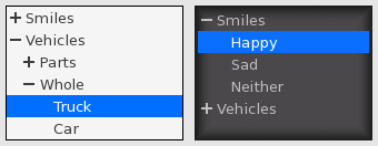
Documentation: TreeView, TreeViewRenderer
Example usage
treeView->addItem({"Smilies", "Happy"});
treeView->addItem({"Smilies", "Sad"});
treeView->addItem({"Smilies", "Neither"});
treeView->addItem({"Vehicles", "Parts", "Wheel"});
treeView->addItem({"Vehicles", "Whole", "Truck"});
treeView->addItem({"Vehicles", "Whole", "Car"});

treeView->expandAll();
treeView->collapse({"Vehicles", "Whole"});

treeView->onItemSelect([](const std::vector<tgui::String>& selectedItem){
    if (selectedItem.empty())
        std::cerr << "No item is selected anymore in TreeView\n";
    else
    {
        std::cerr << "The selected item changed in the TreeView\n";
        assert(selectedItem[0] == "Smilies" || selectedItem[0] == "Vehicles");
    }
});
Notes
When the TextureBackground property is set in the renderer, the BackgroundColor renderer property will be ignored.
When none of the TextureBranchExpanded, TextureBranchCollapsed or TextureLeaf properties are set in the renderer, a - and + will be rendered in front of expanded and collapsed nodes in the same color as the text behind it.
VerticalLayout
The VerticalLayout widget provides a way to automatically position and resize widgets to fill a given area. All child widgets will be placed above and below each other, the width of each widget will equal the width of the VerticalLayout.
Similar widgets:
- If you need to place widgets beside each other then check out the HorizontalLayout widget instead
- If you only want to automatically position widgets but give them a manual size, then check out the Grid widget instead
Documentation: VerticalLayout, BoxLayoutRenderer (VerticalLayoutRenderer does not exist)
Example usage
vertLayout->setSize(200, 500);

vertLayout->add(button1);    // ratio = 1
vertLayout->addSpace(0.5);   // ratio = 0.5
vertLayout->add(button2, 2); // ratio = 2
vertLayout->addSpace(0.5);   // ratio = 0.5
vertLayout->add(button3);    // ratio = 1

// sum of ratios: 5
// height of vertLayout: 500
// height of spaces (gaps between widgets): 0.5 / 5 * 500 = 50
// height of button1 and button3: 1 / 5 * 500 = 100
// height of button2: 2 / 5 * 500 = 200
Notes
The size of the VerticalLayout (both width and height) must be provided, and child widgets will be resized to fit this size. It is not possible to have the layout grow as more widgets are added. You could however manually update the size every time you add a widget, but then the widget is of limited use.
You should never call setPosition or setSize on any child widget that is added to VerticalLayout.